Sinai Menologion
Title: Menologion Diptych
Artist Name: Unknown Byzantine Master
Genre: Religious Calendar Manuscript
Date: Second Half of 11th Century AD
Dimensions: Two panels, each approximately 100 x 70 cm
Materials: Gold leaf, tempera, and wood
Location: Saint Catherine’s Monastery, Mount Sinai, Egypt
Sacred Time Made Visible
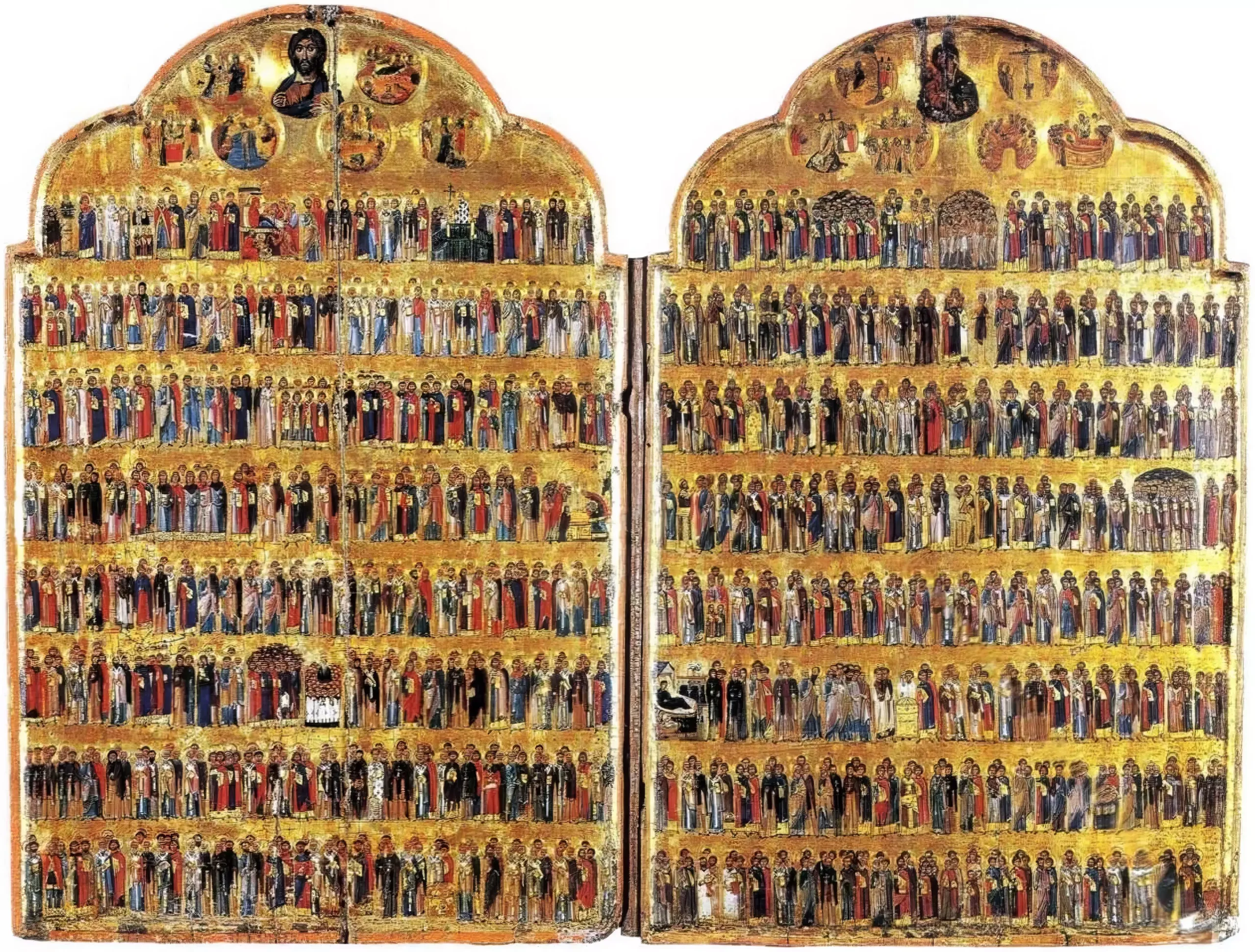
My eyes rest on this extraordinary diptych, where time itself seems to crystallize in gold and color. The Sinai Menologion opens before me like a door into heaven, each panel a window into divine mysteries. The two-part structure isn’t just practical – it’s theological, mirroring the division between heaven and earth while uniting them in a single visual prayer.
As Annemarie Weyl Carr notes in her study of Byzantine manuscripts, these works weren’t mere books but “living expressions of liturgical practice, where each illumination served as a point of connection between earthly worship and heavenly reality” (“Illuminated Musical Manuscripts in Byzantium”).
The gold background draws me in – not flat or static, but alive with subtle variations. Each tiny shift in the surface catches light differently, creating a sense of depth that seems impossible on a flat panel. The artist knew exactly what they were doing. The gold doesn’t just sit there – it breathes, it moves as you move.
Looking at the figures, I’m struck by their arrangement. Row after row, they stand like a great choir frozen in mid-song. But there’s nothing rigid about it. Each saint has their own personality, their own way of standing, their own gesture. The unknown master who created this knew how to make hundreds of figures feel individual while keeping them part of a greater whole.
The colors sing against the gold – deep blues, rich reds, touches of green that feel as fresh as the day they were painted. Hans Belting points out that such works acted as “bridges between the material and spiritual realms, where color itself carried theological significance” (“An Image and its Function in the Liturgy”).
What grabs me most is how the whole thing works up close and far away. From across the room, it’s this amazing pattern of figures floating in golden light. But get closer, and every face tells its own story. The artist paid attention to the smallest details – the way a robe falls, how a hand gestures, the tilt of a head in prayer.
The preservation is incredible. Sure, there’s wear – 900 years will do that. But the essential power of the image is undimmed. Each panel still does what it was meant to do: turn time into space, turn faith into something you can see and almost touch.
I’m particularly drawn to how the light plays across the surface. The artist understood that they weren’t just painting pictures – they were working with light itself as a medium. The effect changes throughout the day, making the whole piece feel alive, dynamic, responsive to the world around it while pointing beyond it.
The Menologion as Sacred Lens
The deeper I look into this remarkable work, the more its spiritual complexity unfolds. The Sinai Menologion isn’t just a calendar – it’s a lens through which Byzantine Christians viewed their relationship with time itself. Elena Velkovska explores this concept in her work on Byzantine liturgical books, noting that “these manuscripts served as bridges between earthly and heavenly time” (“Byzantine Liturgical Books”).
Each row of figures tells multiple stories at once. The saints aren’t just arranged by date – they’re grouped in ways that create visual rhythms and theological connections. I notice how martyrs often appear near other martyrs, bishops next to bishops. But then there are surprising juxtapositions that make me stop and think. A desert hermit might stand next to an empress-saint, their visual proximity suggesting spiritual kinship that transcends social boundaries.
The artist’s technique is fascinating. Looking closely at the faces, I can see how they built up the flesh tones – starting with a dark olive base, adding warmer mid-tones, then those brilliant white highlights that make each face come alive. Some faces show more personality than others. A few seem almost portrait-like in their specificity, while others follow more standardized types. Was this intentional? Did the artist have actual portraits to work from for some saints but not others?
The gold background does something remarkable with space. It denies normal perspective while creating its own kind of depth – not the mathematical depth of Renaissance art, but something more like the depth of a dream or vision. Figures seem to float while remaining perfectly grounded. The effect shifts as you move, as light changes throughout the day. The whole piece breathes with the rhythm of worship.
I’m particularly struck by the handling of architectural elements when they appear. Small buildings, churches, and city walls serve as more than just backdrop – they ground the sacred narratives in the physical world while pointing beyond it. The scale is deliberately non-naturalistic. Saints tower over the buildings, emphasizing their spiritual stature over worldly structures.
The colors work in complex harmony. Deep blues and reds dominate, but there are surprising touches of green, purple, and orange that keep the eye moving. The artist understood how to use color not just for visual pleasure but for spiritual and symbolic purposes. Yet there’s nothing dry or purely symbolic about it – the colors sing with life and beauty.
The preservation tells its own story. Nine centuries of liturgical use have left their mark, but gently. Small scratches and wear patterns suggest how generations of monks have touched and venerated this object. These aren’t flaws – they’re traces of lived faith, making the piece even more precious.
Sacred Encounters in Paint and Gold
The next dimension of this remarkable diptych comes into focus as I study the artist’s masterful manipulation of paint and surface. There’s a profound understanding here of how different materials – gold leaf, egg tempera, burnished gesso – work together to create not just images, but encounters with the divine.
The figures reveal fascinating technical choices. Each face carries its own character, achieved through subtle variations in the standard technique. The artist builds up flesh tones in thin layers, each one slightly more translucent than the last. Some faces show warmer undertones, others cooler – creating a subtle variety that brings the whole community of saints to life.
What catches my eye is a detail I hadn’t noticed before: tiny punch marks in the gold background, creating patterns that catch and scatter light. These aren’t random – they form halos, architectural elements, and geometric designs that only become visible when light hits them at certain angles. It’s a secret conversation between gold and light, visible only to the attentive observer.
The composition shows remarkable sophistication in its use of scale. Some figures are slightly larger than others – not randomly, but according to a careful spiritual hierarchy. Christ at the top sets the scale, with saints arranged below in subtle gradations of size that emphasize their relative importance in the church calendar.
I’m fascinated by the way clothing is rendered. Each garment tells its own story – the heavy folds of bishops’ vestments, the simple robes of ascetics, the rich imperial garments of royal saints. The artist knows exactly how different fabrics behave, how light plays across silk versus wool versus linen. But these aren’t just technical displays – each type of clothing carries deep symbolic meaning.
The work’s placement in the monastery matters deeply too. Standing here, looking up at these panels, I can imagine how they would have appeared in candlelight during services. The flickering light would make the gold seem alive, the saints present as witnesses to the liturgy below. This isn’t just art for looking at – it’s art that actively participates in worship.
The borders between figures create their own visual rhythm. Sometimes saints overlap slightly, suggesting relationships or shared feast days. Other times they stand apart, each in their own golden space. These spacing decisions aren’t random – they reflect liturgical and theological connections that would have been immediately meaningful to medieval viewers.
The paint surface itself holds surprises. In places where the gold has slightly worn, earlier layers peek through – evidence of the careful preparation that went into creating this masterpiece. The gesso ground was scored with fine lines to help the gold leaf adhere, creating a surface that’s still stable after centuries.
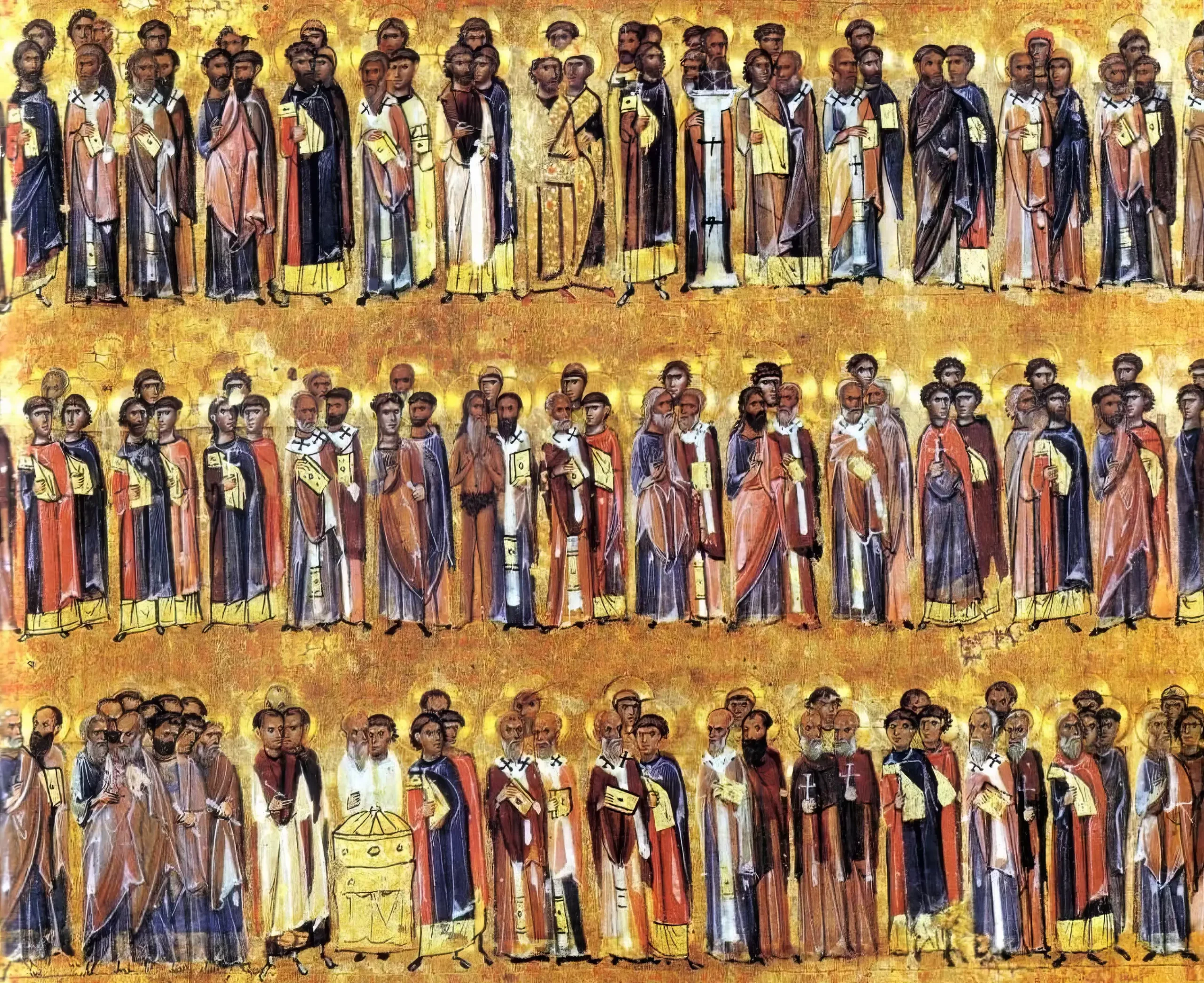
Celestial Hierarchy in Gold
This remarkable detail from the Sinai Menologion reveals the sophisticated artistry behind its ordered procession of saints. Three distinct registers unfold against a shimmering gold ground, each row creating its own visual rhythm while contributing to the overall harmonious composition.
Looking closely at the faces, I notice subtle variations in expression and modeling. The artist(s) used a refined technique of building up flesh tones through successive layers of paint. Dark olive undertones provide structure, while delicate highlights bring each face to life. Some faces appear more individualized, suggesting possible portrait references, while others follow established iconographic types.
The handling of drapery particularly catches my eye. Rich blues and deep reds dominate the palette, with thoughtful touches of white highlighting creating a sense of volume. Each figure’s clothing reflects their spiritual role – the distinctive shapes of monastic habits contrast with the more elaborate vestments of bishops and the simpler tunics of martyrs.
The gold background does something fascinating here. Rather than appearing as a flat surface, it creates an almost immaterial space through careful burnishing and subtle tooling. Small punch marks catch the light differently as you move, making the saints seem to float while remaining grounded in their sacred hierarchy.
The spacing between figures shows careful thought. Some saints stand shoulder to shoulder, suggesting spiritual kinship or shared feast days. Others maintain slight separation, creating visual breathing room that helps structure the overall composition. The regular rhythm of the spacing creates a sense of ordered procession that would have resonated deeply with Byzantine liturgical sensibilities.
Looking at how the paint has aged reveals fascinating technical details. The gold leaf shows slight wear at high points, while protected areas retain their original brilliance. The blue pigments – likely precious lapis lazuli – have maintained their intensity remarkably well. Even areas of slight damage or wear add to our understanding of how this manuscript was used and valued over centuries.
The scale relationships between figures subtly reinforce spiritual hierarchy. Slightly larger figures tend to be more significant saints, though the differences are handled so skillfully that they feel natural rather than jarring. This detail demonstrates how Byzantine artists could combine strict theological programs with sophisticated artistic sensitivity.
A Living Legacy
Standing here with the Sinai Menologion, time seems to fold in on itself. This remarkable work continues to speak across centuries, though its voice has changed. What was once a working liturgical calendar has become something more – a window into Byzantine spirituality, artistry, and ways of seeing the sacred.
The gold still catches light much as it did when it was new, but now it carries the patina of countless prayers, countless gazes. There’s something deeply moving about how this object has absorbed the devotion of generations. The slight wear on certain figures suggests which saints were particularly beloved, touched more often by faithful hands.
The artist’s technical achievements continue to impress. The delicate modulation of flesh tones, the assured handling of drapery, the sophisticated use of scale and space – all speak to a mastery that transcends time. Yet what strikes me most is how these technical elements serve something deeper. This isn’t art for art’s sake, but art in service of the sacred.
Looking at this diptych makes me think about time differently. The Byzantine calendar it depicts isn’t just linear time marked off in days and weeks. It’s sacred time, cyclical time, where past and present intermingle. Saints from different centuries stand shoulder to shoulder in golden eternity. Their stories, though rooted in history, become ever-present through liturgical commemoration.
As I prepare to leave, I notice how the changing light brings different figures into prominence. This constant subtle shift seems like a metaphor for how we continue to find new meaning in old works. The Sinai Menologion remains vital not just as a historical artifact, but as a living testament to how art can bridge heaven and earth, time and eternity.
The preservation of this piece at Saint Catherine’s Monastery feels particularly appropriate. Like the monastery itself, the menologion has weathered centuries of change while maintaining its essential purpose – to connect human experience with divine reality. In our own fractured age, such works remind us how art can unite the material and spiritual realms.
The Unknown Master of the Sinai Menologion
This remarkable diptych comes from an unknown artist or workshop working at the height of Byzantine artistic achievement in the second half of the 11th century AD. Though we don’t know their name, their masterful technique tells us much about their training and skill. The confident handling of gold leaf, sophisticated modeling of faces, and complex compositional arrangement all point to an artist deeply versed in Constantinopolitan artistic traditions.
The work belongs to a specialized category of Byzantine liturgical manuscripts created for monastic use. What sets this piece apart is its exceptional scale and the artist’s ability to maintain consistent quality across hundreds of individual figures. The sophisticated understanding of color harmony, particularly in the use of blues and reds against gold, reveals training in the highest levels of manuscript illumination.
© Byzantica.com. For non-commercial use with attribution and link to byzantica.com
The analysis presented here reflects a personal interpretation of the artwork. While based on research and scholarly sources, art interpretation is subjective, and different viewers may have varied perspectives. These insights are meant to encourage reflection, not as definitive conclusions.
Bibliography
- Carr, Annemarie Weyl. “Illuminated Musical Manuscripts in Byzantium.” Gesta (1989): 25-40.
- Belting, Hans. “An Image and its Function in the Liturgy.” Dumbarton Oaks Papers 34 (1980): 1-16.
- Velkovska, Elena. “Byzantine Liturgical Books.” Handbook for Liturgical Studies (1997): 225-241.